
Friday, April 23, 2010
Unclassed Choropleth map
Classed Choropleth map

Range graded proportional circle map

Star Plots
Correlation matrix
 This correlation matrix portrays a calculated protein, phage 17. The color coding is shown at the right of the matrix. It helps define how correlated or uncorrelated the different proteins are within the series.
Similarity Matrix

stem and leaf plot
 This stem and leaf plot is very simple. It shows the math grades of different students. The pro of using a plot like this is that it's a simple way of categorizing data.
Box plot
 This box plot shows different designs of a project and the stopping points. A box plot is good to use when there are large sets of data. The boxes are color-coded according to which design they go with.
Histogram
 This histogram represents the salary in the thousands of employed people within a company and the amount of people employed with the company. The bars represent the employees. The trend in this plot is that the less employees mean the most money and the least amount of money.
Parallel coordinate graph
 This graph shows the visualization of the genes expressed in a fly. Each parallel line is a gene. Color is used to distinguish between each percentage.
Triangular plot
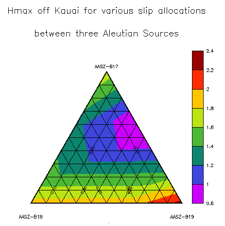 This plot is useful in that it can mix three different data sets. This plot uses three different time sets to calculate the frequency of a tsunami. The colors are used to differentiate between each set of data.
Windrose
 This windrose has a nautical star inside and is surrounded by a compass. The compass not only has degrees but also has the north/south directions that correlate with the degrees. This instrument would be very useful on a ship or on land.
Climograph
 This climograph portrays Argentina's precipitation and temperature for one year in the same graph. The bar graph and the line plot both represent the same information. The general trend of this graph is showing how Argentina's rain and temperature correlate.
population profile

Scatterplot
 This scatterplot is simple and very understandable. The dots represent actual responses and the line is the mean for all responses. This plot is comparing years of experience within the psychology field versus their earning per year.
Index value plot
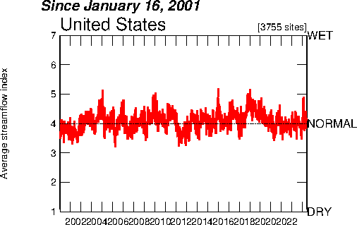 This plot shows the average streamflow index from 2001 until present day. The graph is divided into dry, normal and wet. The theme of this plot is the amount of streamflow over a given period of time.
Lorenz Curve
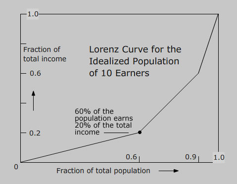 This plotted graph depicts the average earnings of families, from the poorest to the richest. The graph allows the researcher to see data spread out for different subsets of a population. The theme of this graph is the comparison of earnings of families.
Bilateral graph
 This graph displays data collected during the voting process for the presidency in 2009. The running mates are separated by color. This graph enables a researcher to graph two data sets at once. The trend is interested in showing the two running mates popularity of a period of time.
Nominal area choropleth map
 This map portrays the Latino and Hispanic population across Florida. The data was gathered from the 2000 census and was then put into this map. The map is color-coded to differentiate between the population densities. The theme of this map is Hispanic/Latino population in FLorida.
Unstandardized Choropleth map
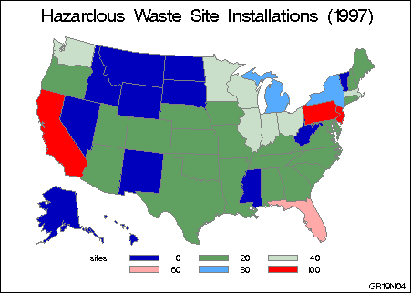 This map shows where the hazardous waste sites are being built around the United States in 1997. They are classified by the state they're in and by color. This map also shows the borders between the states. The theme of this map is showing where waste sites are boing constructed.
Standardized choropleth maps
 This map shows the proportion of Canadians who are classified as obese. They are compared to the national average and then depicted in different colors on the map. The map also shows boundary lines within the country for easier understanding. The trend of interest is obesity and where it is located.
Univariate Choropleth Map
 This map shows the county of Burnside. It is different shades of black in order to differentiate between the areas of distinction. The theme is to graphically portray a county by showing its borders.
Continuously variable proportional circle map
 This map attempts to estimate the population of Michigan and its surrounding areas. The map was create in 1971. The circles are correlated with population density by size and color. The trend of interest is population density in this particular area.
Bivariate Cloropleth Map
 This map shows the population change in Russia on the graph on the right hand side. The left hand side graph shows the population in just the year 2002. Both graphs use color to denote data. The trend of these graphs is population in Russia over varying times.
Digital Orthophoto Quarter Quadrangles (DOQQ)
DEM map
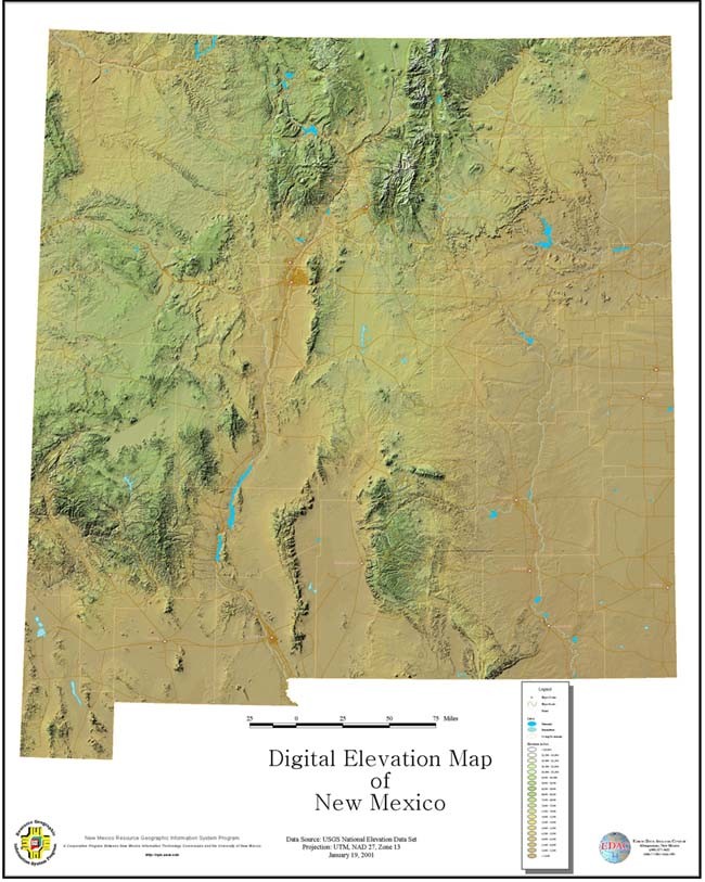 This Digital Elevation Map (DEM) shows the variable elevations in New Mexico. The map also shows the state's waterways. The elevations can be distinguished between each other by their color, as seen in the key on the bottom right. The theme of this map is New Mexico's elevations.
Digital Line Graph (DLG)
 This map shows the city of downtown Savannah, Georgia. Included are its waterways, transportation networks, boundaries and major points of interest within the city. The digital scale was 1 to 100,000. The general trend for this map is the linear information that is occurring in downtown Savannah.
Digital Raster Graphics (DRG)
 This DRG map illustrates the flow of the Colorado River through Texas. DRG's incorporate all topographical information for the area. This map specifically shows the waterways, buildings, roads and elevations. The theme of this map is showing a thorough topographical display of one area in Texas.
Isopleth Map
 This map shows the estimated predications of sudden infant death syndrome (SIDS) from 1974 to 1984 in North Carolina. The map is shaded darker in order to show where the highest incidence of SIDS may occur. The trend of the map is portraying SIDS rate geographically across North Carolina.
Isopach Map
 Isopach maps show the thickness of sediment deposits. In this map the thickness in meters of Tioga Bentonite is show with a dark black line. Tioga Bentonite was a deposit of sediment from a volcano eruption millions of years ago. From this map, researchers are able to study a volcanic eruption that occurred many years ago. The theme of this map is thickness of sedimentary deposits, but it also includes city boundaries and cities.
Isohyet Map

Isotach Map
 This isotach map depicts the hourly, mean wind speeds over Canada in miles per hour. The data was measured 10 meters above the ground. The trend of interest for this map is how strong the gusts of wind are over Canada at a certain time.
Isobar Map
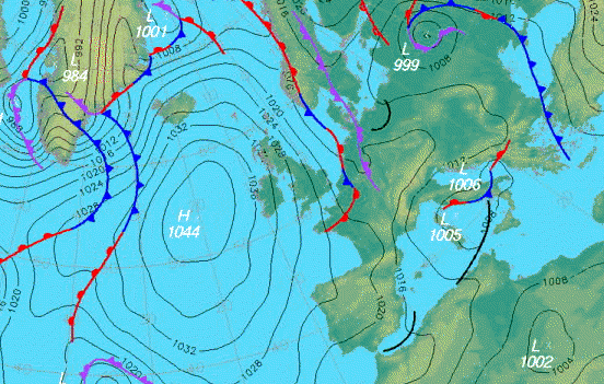 This map shows the pressure systems over the United Kingdom. The black lines are the isobars, which are indicating the points of equal pressure. It can be seen from this map that the wind is less over the ocean, as denoted by the wide-set lines. The anticyclones and depressions, labeled H and L respectively, are included. Also included are the warm and cold fronts. The theme of this map is pressure systems over the UK.
LIDAR
 This map shows New York city after September 11th, 2001. The map uses color and height to illustrate the elevation of the city. This type of mapping can also be used to map landscapes for the use of conservationists needing to see where land is declining. The trend in this map is showing the elevations of New York city.
Doppler Radar
 This map is taken from Doppler radar in Frederick, Oklahoma. It shows the strength of the storm in decibels. The color scale relates to the strength of the storm. The general trend of interest for this map is where the storm is located and how strong it is in certain areas. This map also contains highways and elevations for easier locating of the storm.
Black and White Aerial

This is a photo showing a map of waterways on a college campus in spring of 1997. The photo is labeled like a map in order to show where beaver's dams are located. The main roadways are also labeled. These kinds of maps help environmentalists track animals and their environment. The theme of this map is depicting where the animal's dams are located.
Infrared Aerial Photo
 This image shows the deep water channel in Sacramento, California. This photo was taken using infrared radiation. This type of photographing can illustrate water, vegetation and many environmental changes much clearer than a typical color photo. This particular photo can be used to study the waterways and specific plants around that area.
Cartographic Animation
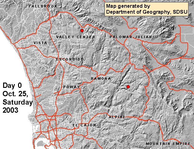 This animated map essentially shows where the fires were located during a week in San Diego in 2003. Major roadways and land elevations are included in the map. The animation also uses different colors to differentiate between total number of fires each day. The trend of interest in this map is where the fires are occurring and to what extent each day.
Statistical Map
 This statistical map shows the population density of people living in the United States per square mile. The trend of interest is seeing where most Americans live within the country. The map gives a visual representation of population density by using "spikes" that can be compared to each other by their height.
Cartogram
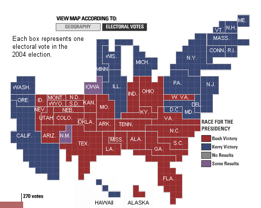 This cartogram illustrates the 2004 electoral college votes for the presidency. Each box within the states symbolizes an electoral vote. The map is also color-coded for each candidate. The theme of this map is which states were voting for which presidential candidate.
Flow Map
 This map shows the traffic flow of communication within Europe. By using lines that are thicker to show more volume of traffic and not including traffic that is beneath a certain limit, the map can be read clearly. This map also incorporates a dot proportional map, showing how large the major cities are compared to each other. The general trend of interest for this map is how and where the flow of telecommunication traffic is in Europe.
Isoline Map

Proportional Circle Map
 The Mexican populations in the Western United States in 1990 is illustrated using proportionate circles. The size of the spheres correlates with the percentage of Mexicans living in that area. This map clearly shows where the highest and lowest populations of Mexican people are living. The trend of interest is seeing where Mexican people chose to live in the 1990's Western United States.
Cloropleth Map
 This map shows the population of Muslim people living in England in 2001. The map is divided into England's subdivisions. The map is one-dimensional and easy to understand. It denotes Muslim people living in certain areas by a color. The theme of this map is where Muslims live in Europe.
Dot Distribution Map
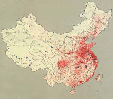 China's population after the 1949 revolution is being depicted in this dot distribution map. The map illustrates where China's population lives compared to each other. Each red dot denotes 50,00 people. The general trend in this map is showing where most of China's population resides.
Propaganda Map
 This map was used in the early 1900's to depict Europe during wartime. The separate countries on the map are being transformed into dogs, invading Europe. The theme in this propaganda map is showing Europe being taken over by beggars.
Hypsometric Map

PLSS Map

Cadastral Map

Thematic Map

Subscribe to:
Comments (Atom)