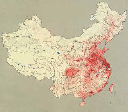
 China's population after the 1949 revolution is being depicted in this dot distribution map. The map illustrates where China's population lives compared to each other. Each red dot denotes 50,00 people. The general trend in this map is showing where most of China's population resides.
Friday, April 23, 2010
Dot Distribution Map
China's population after the 1949 revolution is being depicted in this dot distribution map. The map illustrates where China's population lives compared to each other. Each red dot denotes 50,00 people. The general trend in this map is showing where most of China's population resides.
Subscribe to:
Post Comments (Atom)
No comments:
Post a Comment