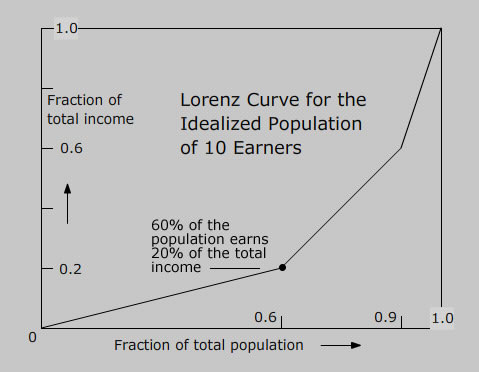
 This plotted graph depicts the average earnings of families, from the poorest to the richest. The graph allows the researcher to see data spread out for different subsets of a population. The theme of this graph is the comparison of earnings of families.
Subscribe to:
Post Comments (Atom)
No comments:
Post a Comment